We set out to create a rich portrait and lifestyle photo series, representing inclusion in front of, and behind the lens. The goal was to provide progressive, colorful, and expressly human images to share with our internal and external brand and marketing partners. Turns out Graphis liked it too and this series won Silver for Photography 2023!
Our why — What lies at the heart of the Microsoft Cloud isn’t complicated code or powerful microchips or massive data centers—it’s human possibility. It’s real people using Microsoft technology to bring their best ideas to life. And because this technology is used by people all over the world, we seek out and welcome diversity in our photo shoots, both in front of and behind the camera. The resulting imagery is candid, honest, and—whenever possible—unretouched. Crooked smiles and deep laugh lines are portrayed with honesty and warmth. Moments of deep concentration are depicted with clarity and compassion. When creating photos for Microsoft Cloud, my POV is to remember that the Microsoft Cloud isn’t, ultimately, a technology story—it’s a people story. And our photography captures that in all its unfiltered glory.
Creative and Photography Direction - Kelly Anderson
Photography - Swanson Studio
Please see other winners here: https://graphis.com/entry/b2e1c1fa-f259-4ecb-9553-1686323eb5d7/
Microsoft Office had been using Microsoft Corporate photography. Once the Microsoft Office Brand Studio was up and running, (a studio I co-created with executive creative director, Douglas Montague) Office needed specific editorial and lifestyle images to align with key marketing moments and sales pipeline activities on the horizon. As creative director, I worked cross group with product managers, marketing managers and engineering to gather requirements and align shot needs, finalize the shot list and get executive approval. Working with Ray Brown Productions out of NYC, and the brilliant international photographer, Bobo Ollsen, we did a shoot day for each of our key audience segments: Consumer, Small Business and Enterprise. We developed more than 600 assets used for marketing, advertising, web and social; delivering one of the biggest brand moments of the year.
The assignment was to do an exclusive beauty photoshoot representing Sustainability, featuring moments of expanse and detail across nature and human-built innovation. We were honored to have this series recognized by Graphis with a Silver Award for Photography 2023!
Traveling across the diversity within the state of California, the approach was to photography as many unique environments, and from as many unique perspectives as possible in a condensed period of time. For nature images, we look for details with textures that can almost feel abstract, and that implies how complex and beautiful nature is. We also look for open environments that show how vast our world is. For human-built images, we look for simple details on complex structures, textures that speak movement, simplicity, and intelligence. Each image tells a story about the relationship of nature, humanity, and innovation in combination. Richly saturated photos of the built and natural worlds, chosen for their shared shapes and patterns.
Creative Direction - Kelly Anderson
Photography - Maggie Hallahan
Pilot Lab in Seattle did the heavy lifting on this beautiful set of brand guidelines. My team was on tap to create the assets, brand expressions and production design for the final guidelines document.
A well-developed style guide is an essential tool for establishing brand identity. A brand style guide (also known as a brand book or brand guide) acts as a key document that helps content creators communicate a consistent message to your audience, so it's a great asset for creating consistent, on-brand content.
Your brand style guide communicates your company's design standards to your whole group. Having this document to reference for expected standards will make the lives of your designers, writers, and developers much easier and give them a solid framework to use as a starting point for their work.
As the Inclusive Design Team introduced Inclusive Design Thinking and presented their Inclusive Workshops to design schools around the country, they were often met with the same feedback: “I didn’t know Microsoft had design roles.” Microsoft Design needed an updated presence that could house the Fluent Design System, Microsoft Design Philosophy, Design Community and Inclusive Design content.
I worked with the agency Tether on the website design. Margaret Price was the Product Owner. With multi-talented photographer Calvin Carter, we worked in-house to capture genuine designer portraits from across the company in a single day shoot. White backdrop, simple lights and personality won the day. I’m still extremely proud of these images. They represent a lot of talented people that I was privileged to work with.
Following brand assessment research, my design team was tasked with creating brand explorations that expressed Office’s four personality traits: Optimism, Dynamic, Authentic and Forward Thinking.
The explorations highlight the flexibility of the design system (that we had been a part in creating) and how easily the elements can be combined in various forms and tuned for the appropriate audience.
Office is a 150-billion-dollar organization, yet they had never had a marketing department dedicated to it’s products. All brand and marketing work was done through a centralized marketing organization that was focused on the overall Microsoft Corporate brand and product portfolio. Faced with the need to compete against products like Google docs, Microsoft invested in building it’s first brand and marketing division dedicated to the Office Suite of digital products. A GM was hired, who brought in an executive Creative Director. The ECD hired me as the Studio Manager/Associate Creative Director (contractor) to help him build a creative design studio from scratch; with me providing the business plan, studio operational processes, approach and evangelism, road maps, staging, hiring designers, on-boarding and relationship building across the Office organization. Prior to the Office Brand Strategy team; product marketers were doing mostly business to business sales. They were suddenly expected to create consumer facing marketed and advertising solutions. That is where the creative studio came in.
Problem Situation
Across the organization there was a need for a product UI and feature screen delivery process that would make readily available high-resolution assets for use in marketing and advertising that were consistent with the build as well as be available in a file format that could be animated. Prior to identifying the gap; we would go directly to the product design team requesting specific feature screens and receive files in all manner of possible delivery types. The product teams were working fast and across the various product teams using different software solutions to create their solutions. They were creating digital customer experiences so of course their files were not in a high-resolution print quality. That meant we couldn’t use their native files to solve for our high-resolution needs; but their files did give us a visual representation of the current build. At the same time I learned that the Product Marketing team was creating advertising and marketing moments so I met with their team to learn how they were obtaining their screens for their various uses. I was looking for a benchmark or perhaps a way for our two groups to not duplicate effort. I learned that their system; while adequate for the work they were doing with their business to business customers, was not of the high quality we were expected to be producing for our direct to consumer efforts. For many of their marketing efforts they were doing low resolution screen shots.
Solution
I recommended that we build out an additional part of the Office Brand Creative Studio to include a small production studio; specializing in the recreation of high resolution product UI screens. Based on the number of products and the upcoming year’s product marketing road map I was able to calculate the number of product screens and feature screens we would need in time for each upcoming marketing moment. That gave me the information I needed to build out a business case for hiring 3 production designers and one producer who would focus on this work exclusively. I proposed a budget, a phased timeline and requested the budget for the following fiscal year. We were granted the appropriate approvals and began hiring immediately. By having a dedicated team re-create current product builds and feature screens we were able to 1) build a consistent library of screens across all of the platforms that were supported in high resolution; allowing a $1M product marketing campaign to be turned around quickly increasing product sales for the launch of the new feature; 2) improve consistent screen shot practices for low resolution screens and 3) free up product design and engineer teams from doing time consuming work that interrupted their digital workflow improving their speed to market and saving over $260k in man hours. The new process also ensured a consistent brand experience and product truthfulness by having up to date screens available on demand.
Azure Synapse Analytics
Web
14,788 unique visitors and 44.1% engagement rate to Azure Synapse Analytics product page
7,131 unique visitors and 37.7% engagement rate to Cosmos DB product page
Social
28K impressions, 431K views and 703 engagements for Azure Synapse (Twitter and LinkedIn) announce motion graphic, with 133 URL clicks/referral traffic to blogs during the first week’s performance
Blog
Azure Analytics: Clarity in an instant drove 7,557 Page views, 2,546 URL clicks/referral traffic, 33% CTR during first week's performance
224% above Azure blog benchmark
Azure Synapse Analytics: Insights for all drove 4,878 Page views, 1,316 URL clicks/referral traffic, 27% CTR during first week's performance
109% above Azure blog benchmark
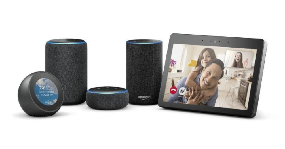
Every few years I take a step back and review my designer tool kit. I’d worked on many new product naming and branding launches but I was looking to be part of a product team, building something from the ground up and delivering it to the customer. Amazon gave me that opportunity as a UX Design Producer within the Digital Devices Studio. The PIM design team created communication apps that ultimately landed on the Echo Show including Voice and Video Calling, Messaging and Contacts. We also led design of the household organization domains: Calendar, To Do List, Shopping List, Timers, Alarms, and Reminders. I was part of the team that established VUI+GUI platform patterns.
Before that we were building the Fire Phone. The first mobile phone with 3D cameras built in. On Fire Phone, my team designed communication apps including: Email, Calendar, Contacts, Dialer and Messaging.
I was fortunate to be Sr. UX Design Producer for two generations of Kindle Fire products, including overall framework, Search, Email, Calendar and Contacts.
Working collaboratively across 1st, 2nd and 3rd party app teams, I conducted 20+ application deep dives with engineers to ensure visual designs and interaction models were in the shipping build.
Tasked with shipping new features, services, products, or systems across the entire Kindle portfolio, I worked with amazing design, product and dev professionals. (Shout out to Blair Beebe and Joseph Buchta) They were generous and helped me add deep skills in the UX design process and delivery at the highest standards. I walked in hoping for a deep dive and was rewarded with a brutal reality check. It was awesome.
The situation
PIM products certainly have tech complexity. The Dev team has to integrate with third-party servers with changing APIs and sync protocols. My team was more focused on the front end experience. We were inventing new controls to make it easier for customers to find attachments, plan events or connect with their most important people.
We had launched new features where we changed some basic interactions. Swipe to delete, pull to refresh, and a moved position for the "new message" button.
We received customer service calls.
The solution
In response, we launched a fast-follow with overlays explaining the new features.
How did the fix perform
The customer service calls stopped. The PIM apps on the Fire Phone got a lot of usage. They were, unsurprisingly, among the most popular apps. Unfortunately, the entire project was a failure.
On tablets, usage of the PIM apps was pretty low. Most people purchase the Fire Tablet for entertainment such as watching videos, web browsing, playing games and reading. Productivity is not a top use case on the Fire Tablets. We had to provide a productivity suite to be competitive and have something to show in product comparison tables, but customers didn’t use the PIM suite of apps a lot. I think fewer than 5% entered their email address and PW in our Email app setup. In addition, a fair number of customers used the browser to check email.
My team had redesigned the visuals before I moved to another org. The tablet team has not touched the design in several years -- mostly because it’s not highly valued by customers, and it works pretty well.
"The new product name is too similar to the core product name and customers are confused"
Coinstar launched a product named Coinstar Exchange, which allows customers to sell their gift cards for cash. The new product was launched on a select number of Coinstar kiosks in different locations. Customer Service began to receive calls from customers trying to use Coinstar Exchange but were unable to determine which of the Coinstar locations had a Coinstar Exchange machine. Some customers drove miles to locations sited on Coinstar.com to only find the original coin counting machine.
Partnering with Research, my team led the development of user scenarios based on Google Analytics and marketing persona research data. Those user scenarios were leveraged to create screeners for user research.
Utilizing Usertesting.com, design led the team in an iterative user research study. Vinny Frye was lead UX designer on this work. Over the course of four studies, usability improved from a 60% passing score to above 85%. But even with the passing usability scores, leadership was unsure on the best navigation and content strategy for the brand and customers moving forward.
To help leadership, design conducted an all-day content design sprint using wireframes to gather feedback on hierarchy and brand strategy.
After the content sprint the team moved forward with a global navigation approach leveraging branded kiosk image markers to help customers differentiate product information and location results.
Key finding: To differentiate Coinstar Exchange from regular Coinstar service offerings online, the page/promotional banners must be marked with the kiosk name, image, and descriptor (i.e coins for cash or cash for gift cards).
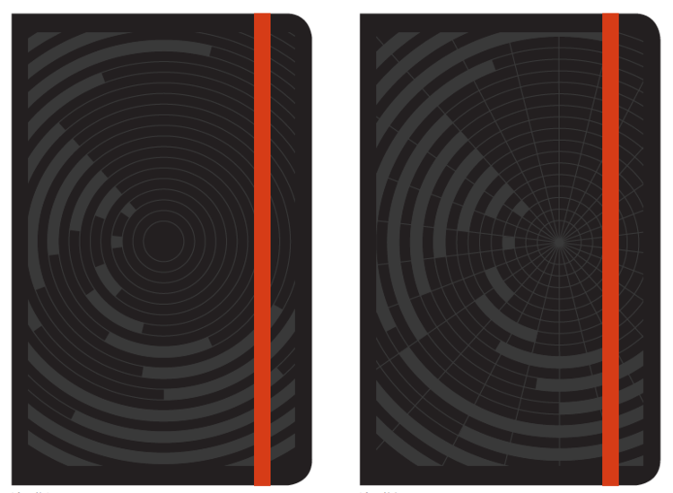
Moleskine has very strict brand guidelines, as does Microsoft Office. The team was tasked with designing a cover solution that could elevate both brands equitably while providing delight and surprise to end users.
Result: Focusing in on data visualization (Microsoft Excel is a featured app within the Office Suite); we landed on a series of concepts that combined Swiss design influence, clean and simple solutions with the embossed leather feature Moleskine would allow. The result was a well received set of designs that were beautiful to behold.
I led design explorations and war room crits. The always magical designer, Marcela Vorel is responsible for the final design of these beauties.
Working alongside Seattle agency HUM Creative; we were looking at ways to modernize and revitalize the tired Microsoft Office symbol, the “threshold.” We intuitively knew it was time to retire the symbol altogether but wanted to do a series of explorations to see what was possible. The biggest problem was the metaphor itself. The “threshold” was meant to symbolize the door to an office; but many workers in the key target audience don’t work in traditional offices anymore. We had lots of fun exploring some very unique and visually intriguing ways to express the brand. None of them were actually used but they are still beautiful.